![]() Knowledge base
Knowledge base
- Coloring Techniques
- Decorating Techniques
- Transfer Print
- Direct Print
- Sublimation
- Magic Mug
- Galaxy Digital 360
- Sensitive Touch - sandblasting
- Laser Engraving
- Hand Made
- Additional decorations
- Delivery costs calculator
- Download
- FAQ
- CMYK imprint - worth to know before imprint
- Product certification
 UAB Renesa
Erdvilo 3
LT47181 Kaunas
Tel.: +37068850643
E-mail: info@renesa.lt
CMYK IMPRINT - WORTH TO KNOW BEFORE IMPRINT
CMYK imprint (decorations made using 4 basic colors: cyan, magenta, yellow black) on promotional mugs is a type of imprint with a great potential. It doesn’t mean that it can be used in each and every case. This kind of imprint has a series of limitations which shall be well known of before placing an order. Often times, a much better solution might turn out to be applying another method (imprints of additional solid colors according Pantone Matching System) or using a completely different technique, like Art Print.
All the pictures used in herein document are solely for informing and training purposes.
download pdf file - click here
1. Color saturation
CMYK imprints are characterized by colors being less saturated. Also, it may happen that some colors have ashy (grey) tone.
 |
 |
|
| CMYK imprints. Colors not vivid, slightly ashy. | Imprint using 6 solid colors (Pantone colors). The colors are visibly more saturated. |
2. Color projection
We don’t recommend the use of CMYK imprints for projects in which a precise projection of colors is required. Especially visible discrepancies may occur in case of red and green colors.
 |
 |
|
| CMYK imprint. Result: unsatisfying tone of green color. | The green achieved by using additional paint according to Pantone Matching System. |
 |
 |
|
| CMYK imprint. Result: unsatisfying red color. | CMYK imprint + additional red ink according to Pantone Matching System (5 colors imprint). Result: clear color as expected. |
3. CMYK imprint on dark mugs.
The glaze color onto which we transfer the CMYK imprint has an important impact on final result. Usually, we can achieve a better result on white and light tone mugs. Mugs with dark glaze (e.g. black, dark navy blue, dark greens) have a negative impact on the quality of achieved colors, especially light colors.
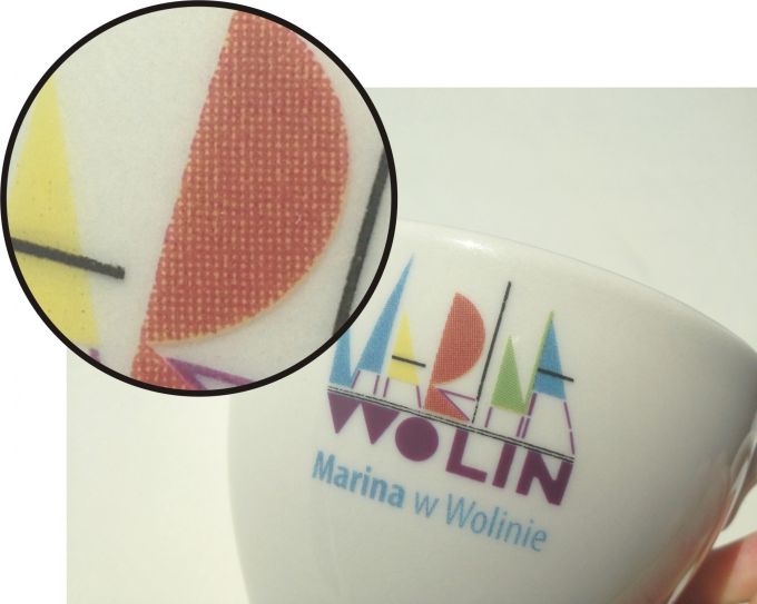
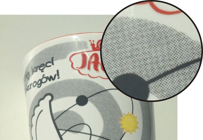
4. Dots visibility
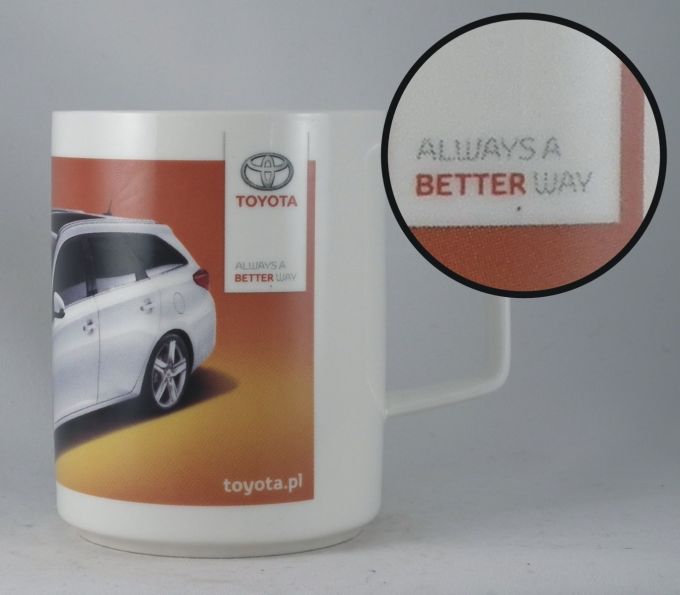
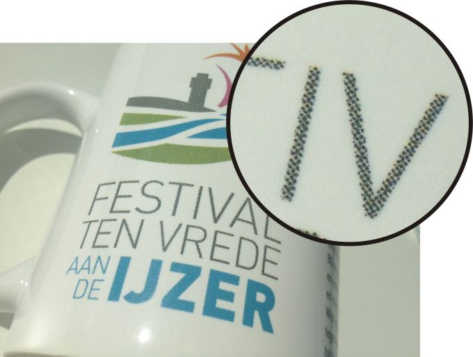
On mugs with CMYK imprint the characteristic dots are visible (especially in close up). Those dots become highly apparent on large, homogenous surfaces.
 |
 |
5. Worse quality and readability of characters (texts)
Inscriptions done by CMYK printing are boldly of worse quality than inscriptions done by imprint according Pantone Matching System. Visible dots create on letters a characteristic ragged edge. That’s why for inscriptions, we recommend using imprints according to Pantone Matching System.
 |
|
 |
6. CMYK imprints – high temperature ceramic transfer print vs Xpression organic transfer print.
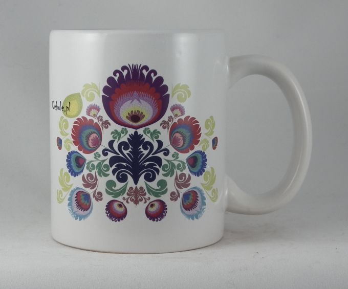
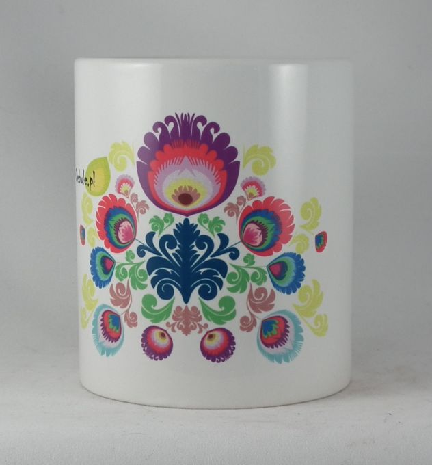
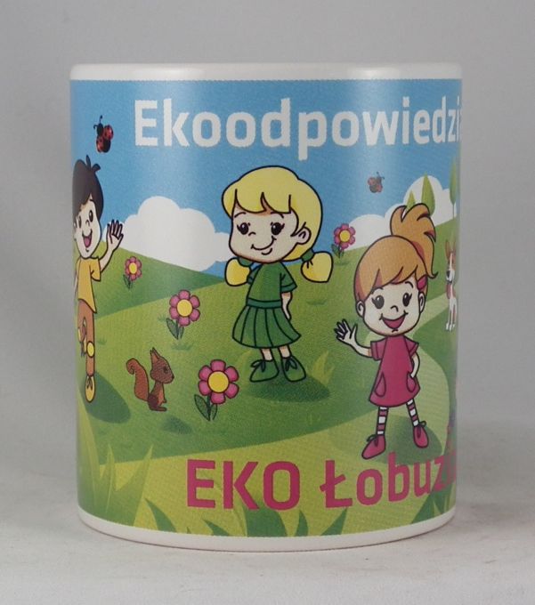
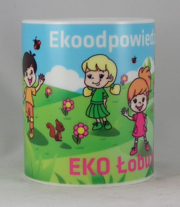
In case of projects with a large number of intense, vivid colors (especially violet, green, pink and red) we recommend using organic decal printing which projects the colors much better. On the other hand, high temperature ceramic decal is a better solution for mugs which will be intensely washed in dishwashers because paints used for ceramic decal are fully resistant to high temperatures and chemicals used in those devices (organic decal printing has a limited warranty for washing in household dishwashers).
7. Differences in color within the same project.
Considering the specificity of CMYK imprints it is possible that within the same project, differences in color may occur. That is the case especially for large quantities where the colors on several individual mugs may be slightly different from one another. The differences in color may also occur when the order is renewed.


